Front pages of Akzia. Clockwise from top left Dec. 19, 2008; Nov. 11, 2008; Sept. 12, 2008; Sept. 26, 2008
Akzia, a free biweekly distributed in cafes, restaurants, business centers, universities throughout 11 cities, including Moscow and St. Petersburg, was first printed in 2001. It's target audience ranges from ages 18-30 and is the number one paper for younger consumers, according to their Web site.
The use of a less traditional photo for the front page makes the paper feel more like a magazine. Most of the front pages use photo illustrations or graphics as their main back drop. What little text used on the front page is small and presented in a concise fashion, further drawing on the concept that less is more. It is clear and uncluttered. The amount of color used is not overwhelming, like an obnoxious tabloid. Instead, the colors complement each other and act as an expressive artistic element. I especially like that the color of the "A" symbol is changed with every issue. The paper does not stick to one main color scheme, which gives the paper unlimited freedom when choosing photos since matching the photos with a specific color scheme is not required.
Inside the paper (pulled from various issues):

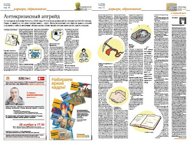
 After sifting through several issues of Akzia, I found it was common to use graphics that solely served as decorative purposes. The red tapestry-like graphic in the first layout offsets the text on the opposite page. Although there is no graphic similar to this on the opposite page, the color brings balance to the page. Opposite the red tapestry graphic, the text mirrored is red. This kind of effect closes in the middle picture and creates a parenthetical effect. The blue border around the story in the second layout also mirrors its opposite page of ads. Also, it shows that instead of asking the writer to extend the article so that it would fill up the entire page, the paper makes use of white space. (I also like the ad on the bottom right. Can anyone translate?)


I chose to highlight these top three layouts because of the way the text wrapped the images. Instead of the traditional justification, the text curves and wraps around circular images. I especially like the page where the text itself creates a pair of legs. I'm not a fan of the graphics chosen in the second photo, (it looks like something that came out of Microsoft Word graphics...) but the way it splits up the text seems like it would make the article easier to read.
Mario Garcia's article on Poynter Online titled "10 Universal Newspaper Designs, Debunked," briefly explains traditional justified type over ragged-right type...
"Readers prefer justified type over ragged-right type. The myth is that ragged-right type implies "soft" or feature material, while justified type represents serious hard news. This, too, is only in the minds of editors and some designers. There is no evidence of the truth to this perception. If newspapers had always set all their text ragged right, readers would have accepted that style. Ragged-right type can change the rhythm on the page, even when used for short texts or for columnists. Its use incorporates white space, which is always needed, and allows for more appropriate letter spacing within and between words. Some research has confirmed that the presence of ragged right speeds up reading."
I think the use of more ragged-right type would help layouts since it would increase white space, de-cluttering stories, and as Garcia said, it would speed up reading.
 This page makes great use of lots of photos and text by balancing it through placement and color. Although there are six photos on this spread, the pictures do not fight each other for space. Instead they work with each other. The background colors of each photo work well with the pictures on the same page and with those on the opposite page. The clean background of each photo also helps create a less visually busy layout, which I think would be difficult to achieve when trying to use six photos.
More Akzia issues here.


No comments:
Post a Comment