Monday, April 27, 2009

Welt am Sonntag

Front pages of Welt am Sonntag


Top to bottom: April 26, 2009; April 19, 2009; March 1, 2009


Welt am Sonntag is a weekly published in Berlin, Germany with a circulation of 400,000. The design of this paper most closely resembles layouts of U.S. newspapers. The font and the lack of white space reminds me of the Wall St. Journal. Still, Welt am Sonntag uses many more graphic and colorful elements in its paper. The teasers at the top of the page also resemble teasers of our national papers, which have cutout images that may overlap the teaser headlines. Colored font like we've seen in the other European papers is not used in this paper.


After browsing back issues of Welt am Sonntag, I came across an unusual layout that I haven't seen in any of the other papers.


The April 5th, 2009 paper started out with this. Thinking it was some type of lead-in to a story, I flipped the page to find this:


An ad for a car. So, not that unusual seeing an ad as the first page of a paper because the real front page with the day's/week's headlines are typically found after the ad. Instead, Welt am Sonntag forfeited a front page for this week and went right to this spread after the ad:


Although there is still a contents section on the bottom left, I thought it was weird to not have a traditional front page. I'm sure the three-page ad was quite pricey, and it gave the paper some more revenue, but was it enough to forgo Welt am Sonntag's traditional front page? We talked in lecture about how advertising departments at papers usually have the upper-hand because without any revenue, there really is no way to publish what the reporters have written. I'm sure ad agencies understand the importance of news content to the paper because it affects who will actually read the paper, and therefore come across their ads. Hopefully these agencies will not
try to take too much control of the paper even if they are the main ones helping produce it...

Anyway, I've also noticed that this German paper frequently uses layouts that has a scrapbook-y feel. By that, I mean many of the pictures used in certain layouts are strewn across the page. Look at the layout above. The pictures on the right page are laid out in a liberal way. The white border of the photos also add to this scrapbook feel of the paper. Here is another example from the March 15, 2009 issue:


I can't decide if using this type of layout for photos works with the paper. It contrasts with the very even columns of text, but I don't know if it adds any interesting element, or is just another obstacle for the reader to overcome when attempting to read the story. An even greater obstacle for the reader is if the text itself were tilted, as seen in this layout from the same issue:


The right page uses an interesting use of open books to separate each little blurb, but I don't think tilting the text helps the reader. Also, because the books took up so much space, the photos on the pages of the book are quite small. I would have liked to see more of the pictures while also having more room so that the text could also be a bit larger.

Layouts should be appealing, but they should not sacrifice the ease of reading a story.

Saturday, April 25, 2009

The News

Front Pages of The News

Left to right: April 23, 2009; April 25, 2009

The News is a daily publication in Mexico City, Mexico. Compared to the other winners of SND.org's "World's Best-Designed," The News has a small circulation of 10,000. Although it is a small newspapers, the design overall is something you'd see at a larger publication. The tidy trim of the text and good choice in photos help tell the story instead of bogging the reader down with too many graphic elements. Also, the standing heads, or headers throughout the paper are denoted by different colors. The muted tones are a light touch to the paper that adds an appealing visual element.

April 25, 2009

In this section titled "Living," the colors of the headline, subhead and the liftout quote draw out the colors of the photo. Using color in this particular story is appropriate because it is a lighter story as it is part of the "Living" section and not part of the day's hard news headlines. The same holds true for in the "Science" section. The orange/tan hues of the headlines draw from the header while they all complement the color of the horses in the photos.


April 25, 2009

At first glance, this "Opinion & Comment" page looks incomplete because it uses such an unconventional lay-out. There is a large white space nearly in the middle of the page while two different stories are laid out on both sides. The column of white space divides the two articles. Since op-ed pieces usually don't have photos, or are many times accompanied by political cartoons, I enjoy this lay-out of all text. Instead of using photos, text is used as a graphic element. On this page, the pullout quote is used as the graphic, artistic element. Also, the ampersands in the header adds a clean visual element. I also like that color is not used in this layout. Colors evoke emotions. As an opinions page, using shades of black helps distinguish its content. For example, in both the "Living" and "Science" sections of this paper, color is used freely. The stories presented in this fashion are not hard-news stories. Although the voices in the stories of the "Opinions & Comments" page are not necessarily hard-news, they present a new perspective to the reader. This perspective should be presented in a manner that is straightforward and able to stand alone.


Although The News has a small circulation, you'd never guess that judging by their design and lay-outs. I wish my small town paper looked this good.

Thursday, April 23, 2009

Expresso

Front pages of Expresso

Left to right: March 28, 2009; March 7, 2009; April 28, 2009

Expresso, a winner of SND.org's "World's Best-Designed," is a weekly publication in Paço de Arcos, Portugal. It has a circulation of 120,000.

For the most part, I didn't find the front pages of Expresso to be very effective. The lay-out is very neat with all the stories and pictures squared off. The headlines use different colored fonts, which I don't think add any functionality to the lay-out. Also, even though the lay-out is very neat and allows three to four stories to be on the page, I dislike how there is only enough room for the lede of a story until it is forced to jump because of a lack of space. When I read the paper, I can honestly count only about a handful of times when I've followed through and jumped to the page with the continuing story. Perhaps Expresso's reason for jumping so many stories from the front page is to make readers flip through the paper. Visually, stories on the front page (especially in the second front page shown) look as if they were cut off on accident because the length of the story is unusually short before it jumps. This is something I'm not used to seeing in U.S. papers.

Other than what I view as awkward jumps on the front page, Expresso does a good job in selecting photos that are very telling, especially in the example below where there are multiple close-ups of this man's face. This allows the reader to see his various facial expressions if they weren't described in the story.


March 28, 2009

But, the bottom of the lay-out has spacing issues. The space between the headline and the start of the story makes it look like there is something missing. Also, the three headlines on the bottom of the spread are all justified differently. It breaks up the amount of story text, but again the white space here makes the page look incomplete.


February 28, 2009
As it appears, this photo illustration is explaining different types of aircrafts. I really like this approach because it uses a lot of creativity. Instead of having a formal chart with each of the nine aircrafts depicted that lists its specs, the planes are placed in their "real" environment, or as they would appear when seen in the sky.


April 28, 2009

Again, the pictures chosen for this story add an interesting element to the lay-out. The string of photos at the bottom create almost a scene-by-scene storyline of its own, which I think helps me feel as if I were present at this event. As for the border, I would like to have seen something less vibrant so that the pictures of the story would have a chance to pop more, seeing that they tell part of the story while the border is merely an artistic element.

If you have a photo that accompanies a story, you don't want to rob its spotlight for a pretty page. Remember, content over design.

Tuesday, April 21, 2009

Print

The recurring topic of my news-editing class is discussing the death of newspapers/print. Talking about it is depressing. On the bright side, my professor said applications for journalism school is on the rise. Now, I wonder if this is because the bad economy is driving more people to apply to grad schools, or if people want to rush in and help save the printed word.

Anyway, don't forget about me and others who are still here willing to buy the paper.

Wednesday, April 15, 2009

A helpful Web site

The Internet, in a sense, is a double-edged sword when it comes to tracking down sources. Keyword searches are helpful, but so many results pop up that I never sift through each and every page, nor would I want to do that. Also, the results may lead you to a page that looks unofficial and unrelated to any big name corporation or institution. When this happens, how do you check the site's credentials?

As we discussed this in lecture, the usual methods, like checking to see if the author's contact is listed or when the page was last updated, were brought up.

A more important technique I learned was about the site's URL domain. I was unaware that people could check domains. I assumed if the domain was .edu, .gov, .org or .net, that everything on the site was good, and for the most part, it is. But, there is a way to further establish a site's credentials at InterNIC.com.

By checking a domain name in InterNIC's "Whois" look-up, you can find out who or what company registered the domain. Sometimes, InterNIC will even list a contact that can be reached about the Web site's content.

I'm excited to add InterNIC into my toolbox of techniques for tracking down sources.

Tuesday, April 7, 2009

Did I say that?

When journalists quote sources, is it OK to clean them up as long as the meanings aren't changed? It's usually unlikely for a source to say something right in the first interview (I know I'm not as eloquent as I'd like to be, and who knows how I'd sound if I were quoted...ick).

The American Journalism Review has an article on quotes where they interviewed several journalists and editors regarding cleaning up quotes and paraphrasing.

Linda Robertson, sportswriter for the Miami Herald, made a good point. She said there are two sets of rules for journalists when it comes to quotes, which she argued as unfair. She said it's unfair to clean up quotes when trying to portray an ordinary person while leaving quotes uncleaned in attempts to embarrass or negatively portray a public figure.

In my opinion, if the quote sounds bad, awkward, wordy, etc., paraphrase.

Sunday, April 5, 2009

Eleftheros Tipos

Eleftheros Tipos is a national daily newspaper in Athens, Greece with a circulation of 86,000. It seems after being awarded "World's Best-Designed Newspaper" by snd.org, Eleftheros Tipos changed their layout. After reviewing the before and after, I think the paper got caught up trying to incorporate too much into a page at one time, and their new layout probably wouldn't have won the award. I'm not sure their original design deserved an award at all...

Left to right: May 2, 2008; May 23, 2008; November 5, 2008

The top images are of the front pages of Eleftheros Tipos that display the layouts that won them snd.org's "World's Best-Designed Newspaper" award. The main images found on the front pages are simple and clean, usually focusing on one main point of the photos. However, the teasers at the top of the page are too cluttered. The images used in the teasers are compelling, but when thrown together, they fight for the reader's attention. For the first two front pages, I can't tell if the article and image on the sidebar have anything to do with the main photo. When I first looked at it, I thought they were separate stories, but on second look, I realize I can't assume that.

Eleftheros Tipos' new design:
Left to Right: April 4, 2009; April 2, 2009; April 1, 2009

The front pages of the new layout is not appealing at all. It looks like someone puked out a rainbow and decided to publish it. OK, too harsh, but I think the overuse of colors, images and text boxes create even more unnecessary clutter than the original layout. All the colors used have equal boldness, so my eyes don't know where to look first.

Inside the original layout (pulled from several issues):


Inside the new layout (pulled from different issues):


The redesign of the cover doesn't note that there was a redesign in layouts throughout the paper. Eleftheros Tipos focuses on using text boxes to section everything off. Although this may help notify readers of a new story, I don't think it works as a whole. Text boxes are supposed to be used for sidebars and supplemental information to the main article. If the main article is in a text box, what do the smaller text boxes stand for?

Also, the text boxes don't allow the paper to form a cohesive structure, especially in the first layout I posted. The first layout has four different stories with four separate picture accompanying each one. This kind of layout looks like a compilation of news stories from separate papers that were pasted onto a page like much like that of a scrapbook.

I do like how Eleftheros Tipos uses red since it is the color of their logo. But, I felt that red was being over-used in attempts to carry this color theme throughout the paper. For example, in the last layout, the subhead is in red text. Although it matches nicely with the red bar on its opposite page, the red color and the big text of the actual headline fight for my attention. I can't tell what's more important.

This is because red and black are both dark colors (well, black is a shade, not a color, but for simplicity we'll just call it a color). Dark colors come forward while light colors recede. Therefore, the newspaper had the right idea by making the background gray so that the headlines and text would pop out, but the placement of red and black text next to each other don't work. The intensity of the two fight for attention on the page.

Tuesday, March 31, 2009

Online Hoopla

The Associated Press printed a list of newspapers that have dropped publication days. There are 14 Illinois newspapers on the list.

I'm not used to getting my news online. I like reading the actual paper. I don't want to go online to read a more in-depth analysis of a certain story. I want it in my paper. I "follow" certain newspapers on Twitter and in more than 20+ Tweets I've received from them, I can honestly say I've only actually clicked on a handful. The headlines are not that enticing to me. When reading the paper, I scan through the pages, but stop more frequently because of graphics and photos. I end up reading stories that have headlines that did not catch my eye.

On Web sites, there may be a photo, but then there is also a slide show which I need to make an effort to look through. This also makes me wonder if the main photo that accompanies the story was chosen carefully, or if the photo was just good enough, and it didn't matter if the photo was perfect since there is a whole database of photos users can click through.

Of course, to every issue there are numerous pros and cons. Although I'll miss looking to printed pages for my news, online news has its perks in the unlimited amount of space provided by the Web and also in the instantaneous publication of news right as it happens.

Thursday, March 26, 2009

Winner of SND.org's World's Best Designed for a second year in a row


Front pages of Akzia. Clockwise from top left Dec. 19, 2008; Nov. 11, 2008; Sept. 12, 2008; Sept. 26, 2008

Akzia, a free biweekly distributed in cafes, restaurants, business centers, universities throughout 11 cities, including Moscow and St. Petersburg, was first printed in 2001. It's target audience ranges from ages 18-30 and is the number one paper for younger consumers, according to their Web site.

The use of a less traditional photo for the front page makes the paper feel more like a magazine. Most of the front pages use photo illustrations or graphics as their main back drop. What little text used on the front page is small and presented in a concise fashion, further drawing on the concept that less is more. It is clear and uncluttered. The amount of color used is not overwhelming, like an obnoxious tabloid. Instead, the colors complement each other and act as an expressive artistic element. I especially like that the color of the "A" symbol is changed with every issue. The paper does not stick to one main color scheme, which gives the paper unlimited freedom when choosing photos since matching the photos with a specific color scheme is not required.

Inside the paper (pulled from various issues):

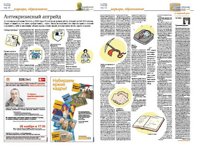
After sifting through several issues of Akzia, I found it was common to use graphics that solely served as decorative purposes. The red tapestry-like graphic in the first layout offsets the text on the opposite page. Although there is no graphic similar to this on the opposite page, the color brings balance to the page. Opposite the red tapestry graphic, the text mirrored is red. This kind of effect closes in the middle picture and creates a parenthetical effect. The blue border around the story in the second layout also mirrors its opposite page of ads. Also, it shows that instead of asking the writer to extend the article so that it would fill up the entire page, the paper makes use of white space. (I also like the ad on the bottom right. Can anyone translate?)


I chose to highlight these top three layouts because of the way the text wrapped the images. Instead of the traditional justification, the text curves and wraps around circular images. I especially like the page where the text itself creates a pair of legs. I'm not a fan of the graphics chosen in the second photo, (it looks like something that came out of Microsoft Word graphics...) but the way it splits up the text seems like it would make the article easier to read.

Mario Garcia's article on Poynter Online titled "10 Universal Newspaper Designs, Debunked," briefly explains traditional justified type over ragged-right type...

"Readers prefer justified type over ragged-right type. The myth is that ragged-right type implies "soft" or feature material, while justified type represents serious hard news. This, too, is only in the minds of editors and some designers. There is no evidence of the truth to this perception. If newspapers had always set all their text ragged right, readers would have accepted that style. Ragged-right type can change the rhythm on the page, even when used for short texts or for columnists. Its use incorporates white space, which is always needed, and allows for more appropriate letter spacing within and between words. Some research has confirmed that the presence of ragged right speeds up reading."

I think the use of more ragged-right type would help layouts since it would increase white space, de-cluttering stories, and as Garcia said, it would speed up reading.

This page makes great use of lots of photos and text by balancing it through placement and color. Although there are six photos on this spread, the pictures do not fight each other for space. Instead they work with each other. The background colors of each photo work well with the pictures on the same page and with those on the opposite page. The clean background of each photo also helps create a less visually busy layout, which I think would be difficult to achieve when trying to use six photos.

More Akzia issues here.

Tuesday, March 24, 2009

World Classic Baseball

I'm not a huge sports fan because getting that emotionally involved and then being let down by the team you're rooting for seems unnecessary, but I can still enjoy the occasional Bulls or Cubs game. I don't really understand football, so no Bears for me.

Yesterday was the World Classic Baseball championship between Japan and Korea. Sadly, I got emotionally involved and was let down when Japan beat Korea 5 to 3, but overall it was a great game. There were home runs, stolen bases and the game even went into an extra inning.

While watching, I couldn't help but notice that whenever the sports announcer referred to the Korea team, he made it a point to specify that it was "South" Korea. But, the scoreboard referred to the team as "Korea," not "S. Korea or "South Korea." Why?

I frequently get asked about where I'm from, South Korea or North Korea. I still don't know how to answer, so I just say South Korea because that's where ma and pops were born. (At first, I say I'm from Chicago because that's where I was born, but people stare and ask me where I'm really from. Then I understand that they're trying to ask about my race, which is a mistake I admit to making myself when inquiring about someone's race.) However, their parents were born in all regions of Korea before the Korean War and the formation of the 38th parallel, which splits the north and south of Korea. I guess the question may be about what country I support? I'm not sure.

Anyway, quick shout out to my "#1" fan Kim. :)

Tuesday, March 17, 2009

Hours worked and number of phone calls are directly related?

The News-Gazette ran a story Sunday with the headline, "Phone records show county auditor frequently absent." My professor for Reporting II lecture asked the class to read it and point out ways to improve the story.

The story relied on the Freedom of Information Act to obtain phone records of elected county officials, but the story also presented its findings poorly.

The second through sixth paragraph (pretty much the bulk of the story) basically lists the information found through FOIA. X number of calls were made by Y last while X number of calls were made by Z last year. This goes on. Safe to say, I got lost in the numbers. Also, The News-Gazette printed a table listing said numbers at the end of the story. Is it necessary to reiterate the same information in a chart?

The story's argument here is that auditor Tony Fabri was not at his desk making phone calls while his co-workers were hard at work making over thousands of calls. Fabri claims this is because he makes his calls from his private cell phone. He also said he relies on the accountant to do most of the paper work anyway.

Fabri sticks out like a sore thumb when comparing his number of calls made to those made by his colleagues. Their numbers range in the thousands while his stands at a measly 185 of calls made between March 1, 2008 - Februrary 28, 2009.

This makes me wonder if phone calls are directly related to the number of hours worked. I'm not choosing sides, but let's say the thousands of phone calls made by the other elected officials weren't work-related. The tables could be turned. Fabri doing work. Colleagues jibber-jabbering away while on the job.

So, I don't think it's legitimate to assume more phone calls made means more work is being done.

I make a lot of phone calls, and they're mostly to my mom about what I ate, when I slept and probably what I'll eat for my next meal. No work involved.

But, why is Fabri running up his private cell phone bill making work-related calls? Is he hiding something? This may be a bit of a stretch, but I can't help that my perception of elected officials has been tainted because of our very own Blago...

Friday, March 13, 2009

World's Best-Designed

Society of News Design's 30th Annual "The Best of Newspaper Design Creative Competition" relied on five judges from newspapers industries all over the world who sifted through 301 entries and named five newspapers the winners. All five were international papers, four from Europe and one from Mexico.

Akzia, a biweekly with a circulation of 200,000 in Moscow, Russia

Eleftheros Tipos, a daily with a circulation of 86,000 in Athens, Greece

Expresso, a weekly with a circulation of 120,000 in Paço de Arcos, Portugal

The News, a daily with a circulation of 10,000 in Mexico City, Mexico

Welt am Sonntag, a weekly with a circulation of 400,000 in Berlin, Germany

The judges chose these newspapers based on many characteristics, but one that stood above the rest was accessibility of the paper to readers. Good journalism is always key, but integrating the writing, photography, graphics and design is a task that not all contestants demonstrated.

The trend in newspapers layouts the U.S. has shifted from broadsheets to "broad-loid," which is a narrower form of the broadsheet. However, papers around the world have turned their broadsheets into compact papers, also known as a tabloid. Judges of the competition claim that the tabloid style is logical and also attracts younger readers.

The compact size of the winning newspapers create a modernistic approach to the age-old newspaper. What once used to be associated with style magazines is now the new magazine newspaper, pairing news and views together.

Judges also shared that although many American newspapers entered the contest, they were not chosen as winners because of the lack of risks taken regarding design and details. In the past year, US papers had lots of opportunities to play with graphics, photos and text, especially with the election.

After browsing through the layouts of the winners, I found the differences between the winners and the papers I usually read, including the Tribune, the New York Times and the occasional Wall Street Journal, to change the way I view newspapers. I pay more close attention to the use of graphics and photographs, assessing how they really accompany a story. Also, the winners' layouts use air, or white space, to their advantage. This is a refreshing take on the papers I read where instead of using this white space, text is spread out over any and all the little space that may be available.

Monday, March 9, 2009

"(Emergency!)"

Illini-alert is a new program being used by the University of Illinois to notify its users of emergency situations on campus.

Yesterday, mass text messages and emails were sent to students/faculty/employees through Illini-alert to inform them about a campus-wide power outage. I was driving back to school from the Chicago area when I received this message on my phone.

The subject line read, "(Emergency!)" and I'm not sure the exclamation point was necessary. This power outage or any other emergency should call for the use of such punctuation. The word "emergency" carries enough urgency as it is.

Also, the text message/email ended in, "Check local media for details!" The exclamation mark in this sentence resembles some sort of promotional tool, similar to what you'd expect on a contest poster or an ad about a clearance sale.

According to the 7th edition of When Words Collide by Lauren Kessler and Duncan McDonald, exclamation marks should be used to express strong emotions or express surprise, which does not justify either of Illini-alert's uses of the punctuation(!)

I actually don't feel that strongly about the misuse of the exclamation mark, but I thought it was worth mentioning because it bothered me some.

Monday, March 2, 2009

Where are we headed?

After nearly 150 years, Rocky Mountain News, one of Colorado's daily newspapers folded on Friday, February 27.

With the downturn in the economy, newspapers and magazines, like many businesses, are filing for bankruptcy or just downright going out of business. This got me thinking about the death of newspapers, a topic several of my journalism classes have either heavily focused on or briefly mentioned.

Not quite the comforting news you want to hear when you're hoping to find a job in the industry, but is it reality or not?

I remember in Reporting I lecture, which I took about a year ago, Professor Ron Yates refuted the idea of newspapers becoming obsolete. One of his arguments was that most people spend their time in front of a computer while at work, and they wouldn't want to spend even more time on the computer once they're home to fetch their news. Also, the nostalgia that comes from sitting down with a newspaper in-hand simply can't be offered by the web.

Yet, there is a certain population of younger generations who are not used to the idea of paying for their news. Instead, they're used to receiving their news in their inboxes for free, and this makes me a little apprehensive.

The video on the Rocky Mountain News site could quite possibly be the most depressing thing I've seen since watching Titanic, but, at the same time, it gives me hope. The passion and commitment the employees at Rocky Mountain News displayed in the video make me optimistic about the future of newspapers. I like to think these employees are a snapshot of each and every newsroom across the nation, perhaps even the globe, and that they'll help keep newspapers alive.

Let's hope I'm not just being naive.

Elections, elections, read all about it

For the next couple weeks, I'm going to be sharing my thoughts on newspaper layout designs. For my first post of this series, I decided to focus on Chicago Tribune's front page designs of the past two elections.

In September 2008, the Trib redesigned their paper using more magazine elements and reducing the number of jumps in articles. Also, there is an index navigation at the top of each section, which I think is cool because it maps where you are, which is especially helpful when you're reading the Sunday edition. I know when I've read Sunday editions before the redesign, it was difficult to sift through all the sections because they were sorted in separate piles and hidden within one another. With the new navigation bar, it's easier to tell whether I want to flip forward or go back a section. It's also just a fun element that livens the paper up a bit.

The redesign gets rid of the staple Tribune blue in its masthead, but I think this marriage ended blissfully. Getting rid of the blue in the masthead allows for more room to use colored pictures without having to worry that it will clash with the blue. The masthead now uses a color photo as the background, modernizing the 161-year-old publication.

2004 Election
So, here's the front page of the Trib's final edition, Wednesday, November 3, 2004. (Sorry it's black and white. I couldn't find a color one, so I got this from the university's library.) Even though this paper is from the 21st century, it certainly does not look like it. The font used in the headline dates the look, and there is nothing in the format of the layout that excites the eye to move from graphic to graphic. Granted this election was post ballot recounts of 2000 and also during Bush's decline in popularity, I can see why the headline does not evoke as much excitement. It even reads with a monotonous tone. (Or could that be my bias because of all the negative media about Bush since his re-election?) Still, the paper should have shed more positive light on the selection of our nation's leader.


2008 Election
Here's this year's front page from the Trib printed Wednesday, November 5, 2008. How refreshing. With its redesign, the Trib has so much more liberty to use artistic elements in packaging its stories. The whole front page is designed like a magazine, with the large photo as a background and the text nicely spaced out at the bottom of the page. There is lots of white space, which is a new innovation in modern papers. Lots of papers like to fill its pages with text, text and more text, leaving little room for the reader to breathe, which risks losing them in a world of information overload.

Some may argue that the look of newspapers are what signifies a newspaper, and that magazine layout designs should be left to, well, magazines, but with the rise of online news sites, it's necessary for papers to follow and complement these sites. I completely agree that stories should be able to stand alone. But in an era with so many news sources, sites, blogs, papers, tabloids and much more, people are left to sort through the mess alone. Newspapers should help by packaging stories in a way that is easiest for readers to digest. Papers need to evolve with their readers. They need to change as they're now competing against clean, innovative web layouts for their readers.

Share what you think of these two layouts. :)


Tuesday, February 24, 2009

I have a weak stomach...

All these photos were too graphic for my tolerance level and I had difficulty deciding which I would choose to print. Here's what I came up with...

Dwyer photo: While reviewing this series of photos, several questions came to mind. Does the paper have to be sensitive to Dwyer's family and friends? Is it appropriate and respectful to show this man at his lowest point for all the public to see? Understandably, as Pennsylvania treasurer, Dwyer was a public figure, so his role in the spotlight is a given. That being said, I would most consider printing the first of the four because it captures his emotions in a way that maybe text could not. It can complement the story well.

1. This photo is OK to print because it is neither harming nor inhumane.

2. This photo is not OK to print. I've made the argument to run the Dwyer photo because it does a good job of capturing his emotions. Although this photo does an equally or even better job of capturing raw emotions of the persons pictured, the contents of the photos make it not OK to print. In this photo, the body bag is open and the dead boy is seen lying on the ground. Printing a photo of a dead body is disrespectful and distasteful.

3. Again, out of respect for the victim's loved ones, this photo should stay out of print. The victim's face is somewhat identifiable and there are bits of whatever was shot off the victim's body on the floor. The gruesomeness of this photo is too extreme.

4. I think this photo is OK to print, but I don't see it as necessary. The writer could show this scenario within the text.

5. This photo is not OK to print. The caption states that the woman's face is blurred to protect her identity. If this woman saw this photo, the papers who printed this are forcing her to relive this moment. Also, many of the faces in the crowd are identifiable. This could cause problems of mistaken identities.

I know pictures attract readers to a story, but printing the most shocking photos for dramatization should not be used as a deciding factor.

Tuesday, February 17, 2009

"Station to station, desensitizing the nation" -Jack Johnson, singer-songwriter

Reporting on tragedies is, to say the very least, a tough job. On top of that, having to portray tragedies in an ethical light poses its own issue.

When I think about the news I saw and read about both the NIU and Virginia Tech shootings, images of victims, some bloody, being carried by police or on stretchers with bandages around their limbs pop into mind. In some photos, the faces of these victims are seen clearly and most likely recognizable to their family and friends. Did papers need to publish these photos? The Los Angeles Times, Alabama's Press-Register and New Mexico's Daily Lobo are just a few that did. Is reading something along the lines of "five dead at school shooting" not as believable as seeing a scene of the tragedy? Do we really need to see to believe?

I found an interesting read online that explains the use of photos portraying "Victims of Violence." Although one of the sources, Ombudsman George Beveridge, argues that written words are unable to convey the emotions evoked through photos, does the shock factor outweigh the negative effects on those personally involved? Beveridge defended his paper's decision to publish gruesome photos of killed U.S. servicemen who had attempted to rescue American hostages in Iran in 1980; their bodies were "char-red." He argues that as long as the photo is accurate, it is OK to publish.

The Society of Professional Journalism's Code of Ethics states that journalists should, yes, seek truth, but should also minimize harm. I'm sure family members and friends of the victims pictured in the school shooting were harmed when they saw a photo of their loved one in the middle of the tragedy. In times like these, where immediate contact with victims are nearly impossible, the first news received about loved ones may have been captured in a published photo. There is harm caused here. When I view these images, I feel the sadness and hurt of the tragedy; I can't imagine what it must be like to personally know these individuals. I mean all I can relate to is the fact that we're all students on a campus pursuing some sort of degree. These photos serve to put us in the scene of the tragedy by showing the real, raw truth of the event, but is doing so ethical? Do these pictures serve a greater purpose?

I can't decide...

Friday, February 13, 2009

They say a picture is worth a thousand words...

In February 11th's Daily Illini, there was an article highlighting the University Dining Hall's new policy on disclosing nutrition information. Along with offering this information online, the dining hall now posts the information in the dining hall where it is more accessible and relevant to the students. This is all helpful and great, but I just don't know if all the facts provided by the dining hall are correct. The graphic provided by the DI disclosed the calories, protein, fat and carbohydrates in a serving of several foods, among them "jasmin rice." (Spelling error #1) In the jump of the article, there is a photograph of the actual hot food line, with nutritional information written in marker probably by a worker. From the photo, "Seasoned Green Beans," can be seen clearly and so can "Protien." (Spelling error #2) With spelling errors like these, I just don't know if I can trust that my seasoned green beans are actually one calorie from fat as posted.

But, I guess people can glance over minor details and take what the paper says to heart. After all, journalists are all about exposing the truth. Unfortunately, there are several journalists who abuse their privilege and outright lie. Such is the case with Jayson Blair. Blair fabricated countless articles for The New York Times before he was caught. Along with blatantly making up quotes and names, Blair never even attended the events he was assigned to cover. In my News Editing lecture, we watched an interview clip of Blair, and he described how he made up the last name of his main source in order to use this person's quotes. How can this source not tell the editor, or did he not read the story? Also, there are several rounds of editing in the newsroom, so how did the editor miss a person's name?

There's a trust that builds between editors and journalists, but there is a difference between trusting and merely double-checking facts in a story.

Wednesday, February 4, 2009

"Freakin' Fabulous"

Last week I searched high and low, visiting all campus bookstores, for the highly popular Elements of Style by William Strunk Jr. and E.B. White. To my dismay, none of the stores had it in-stock. With little options left, I headed over to Borders. As I was walking to the Reference section, I got distracted by this hot pink cover graced by none other than the fabulous Clinton Kelly. (Kelly co-hosts TLC's What Not To Wear with Stacy London)

It may seem that Clinton Kelly is just another reality TV star who, although is considered a fashion genius, may not be widely perceived as a smart guy. But, his credentials say he deserves way more credit. Kelly received a B.A. in Communications from Boston College and a master's degree from Northwestern's Medill School of Journalism. He has also been editor/deputy editor of major fashion magazines, such as Marie Claire, Mademoiselle and DNR, before becoming the nation's go-to guy in fashion crises.

Although the title of Kelly's new book--Freakin' Fabulous: How to Dress, Speak, Behave, Eat, Drink, Entertain, Decorate, And Generally Be Better Than Everyone Else--made me cringe, my mild obsession with Kelly drew me in.

Naturally, as a journalism student, I turned to the chapter on how to speak. I was expecting to be bored with a laundry lists of do's and don't's and new, hip slang, with the occasional side of pretty pictures, but Kelly proved me wrong. Kelly was teaching grammar. He wrote about the differences between lie and lay; fewer and less. Yeah, he used silly examples, like "I lay my gin on the table," but at least he's getting the point across.

Kelly, like all journalists and writers, stresses the importance of proper grammar. A little punctuation mark in the correct place goes a long way. As journalists, our credibility rides on our ability to understand and apply the proper rules of grammar.

x